Our services

You may not need everything — but you should have access to it.

A digital illustration featuring various security and data analytics icons, including a shield, a graph, a pie chart, and coins, representing cybersecurity and data security concepts.

See what comprehensive really means.

Financial planning & budgeting

A financial retirement analysis dashboard displaying charts. The top section shows probability of success for proposed (82%) and current (56%) plans with bar graphs. The middle section presents a stress test with bar graphs comparing success probabilities across different factors like baseline, market drop, taxes, social security, longevity, inflation, health care, and asset return. The bottom section contains a cash flow overview with inflows, outflows, expenses, and savings, visualized as a flow diagram.

The foundation for everything

A budgeting app screen showing expenses with a circular chart highlighting dining out at 8.9%, totaling $9,928 in expenses. The chart is labeled with categories like housing, utilities, auto, groceries, and others. Tabs for summary, activity, transactions, and budget are visible, with activity tab selected and a dropdown for time period set to last 3 months.

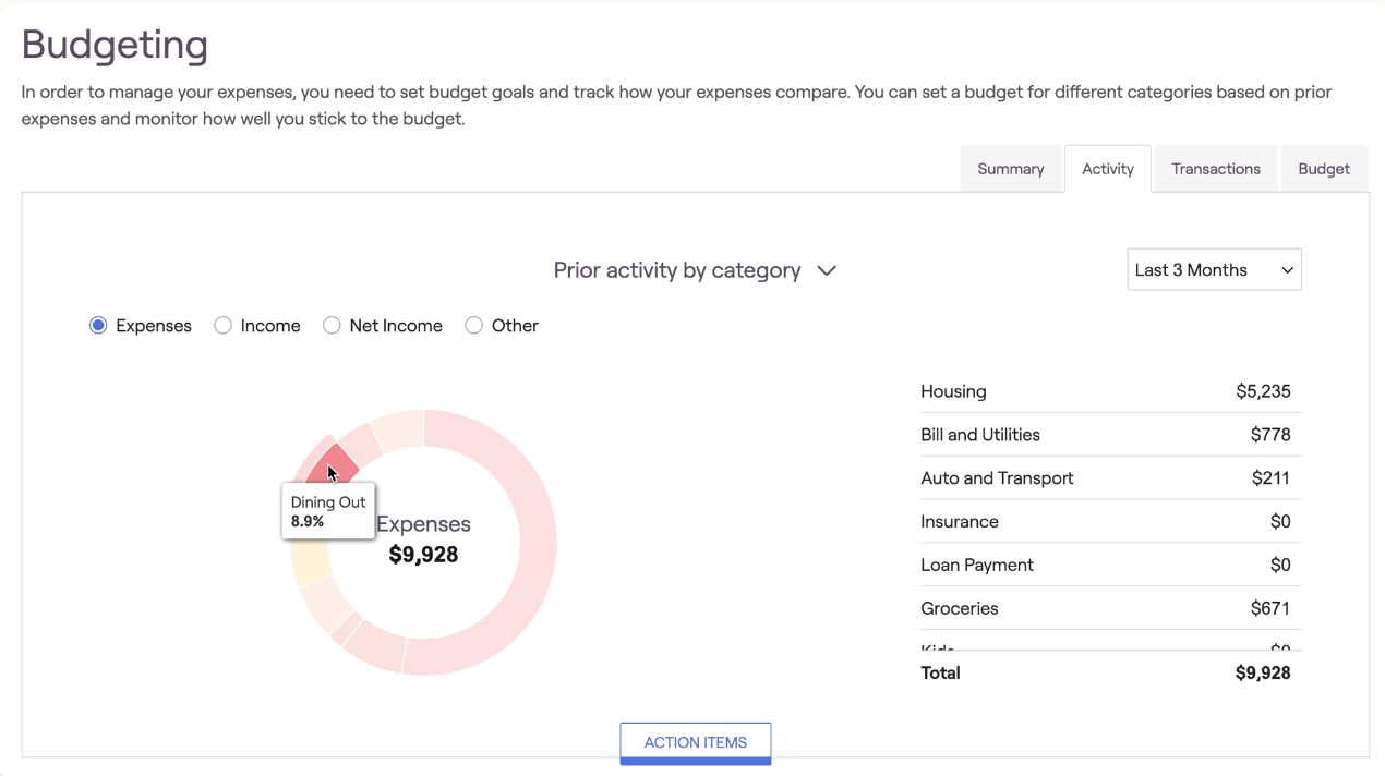
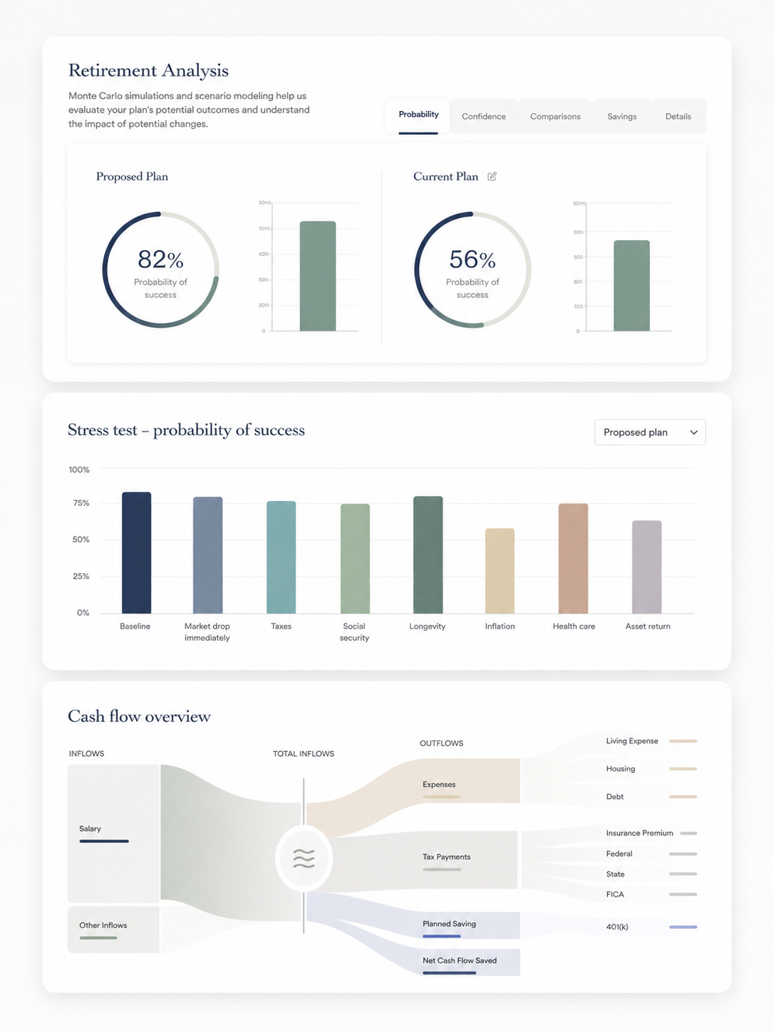
Your entire financial life, working together. We build a clear plan across retirement, investing, taxes, estate, and cash flow—so every decision moves you forward. No silos, no handoffs, no gaps. Free tools to aggregate your entire picture, set and track budget goals, and understand when things change. All with an Advisor to help. Read more about what you may be missing.

Investments

Beyond "set it and forget"

A financial investment or stock portfolio screen displaying holdings, shares owned, and amounts for VOO, QQQM, DIA, and cash.
Color-coded pie chart showing investment allocation with categories: Equity (blue), Fixed income (orange), Cash within funds (light green), Cash held directly (dark green), Other (gray) with a legend.

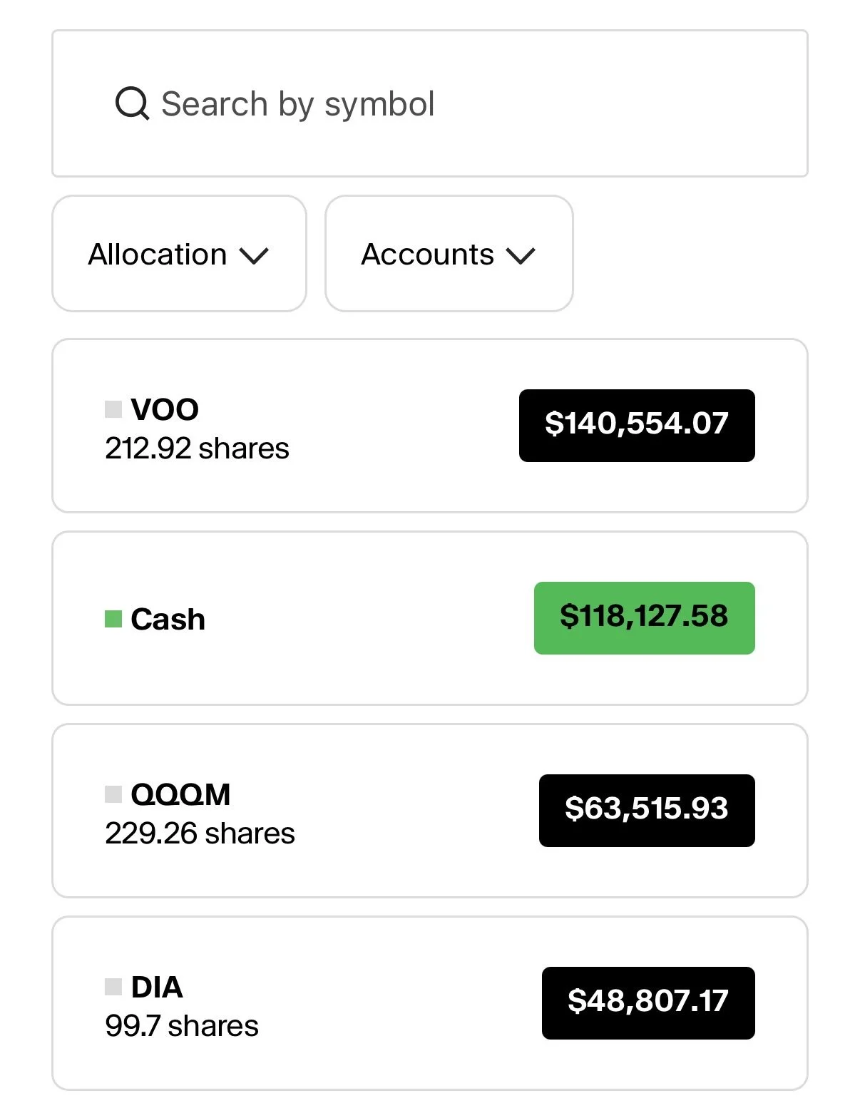
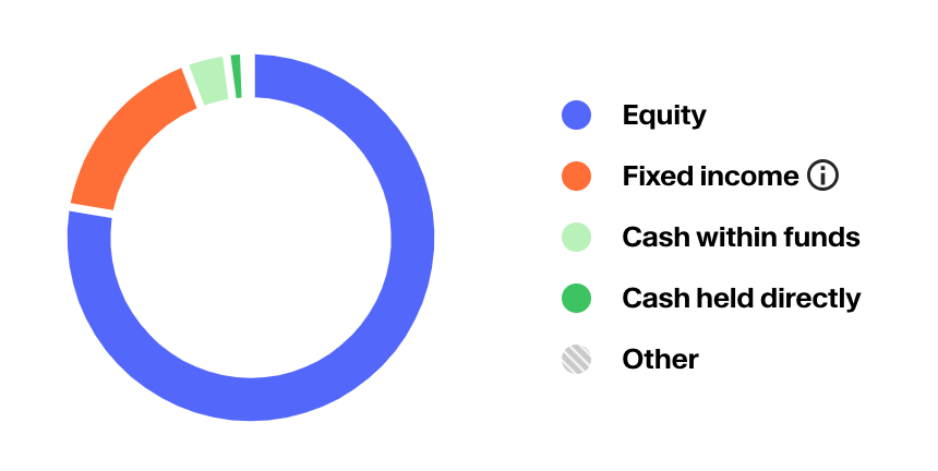
You have countless investment options. We believe that all of the investing basics should be covered, but you should also have access to the same offerings available at UHNW private banks. More on this below.
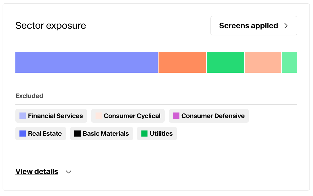
Estate planning

Screenshot of an estate planning website dashboard showing assets valued at $150,000 and plan strength rated as exceptional. It includes sections for documents like last will & testament, HIPAA authorization, power of attorney, and advanced health care directive, with statuses marked as complete or review.

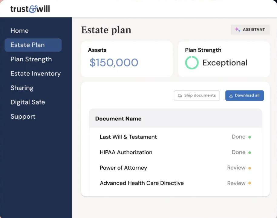
For the next generation

A chart titled 'Estate flow chart' illustrating the distribution of assets and taxes for estate planning, divided into sections for estate and out of estate, with color-coded boxes showing net worth, estate value, taxes, fees, and charitable donations.

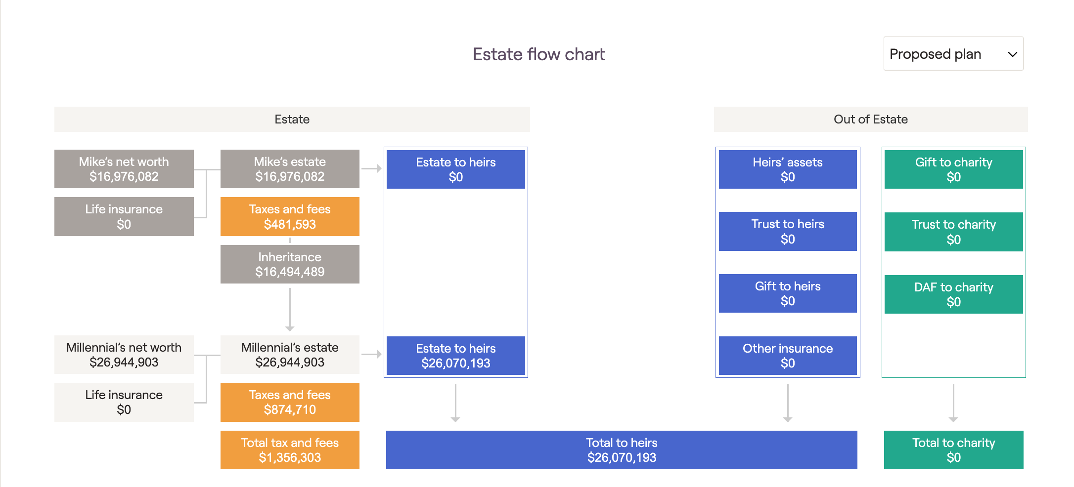
Protect what you’ve built and make things easy for the people you care about. All clients receive free premium access to Trust&Will as part of your overall plan—not as an afterthought or upsell. Make and update your family’s wills and trusts in coordination with your advisor.

Tax loss harvesting

Financial report showing estimated tax savings of $1,948.21, a tracking error of 1.64%, and account holdings with 657 total accounts, including 349 primary model accounts and 308 not in model.

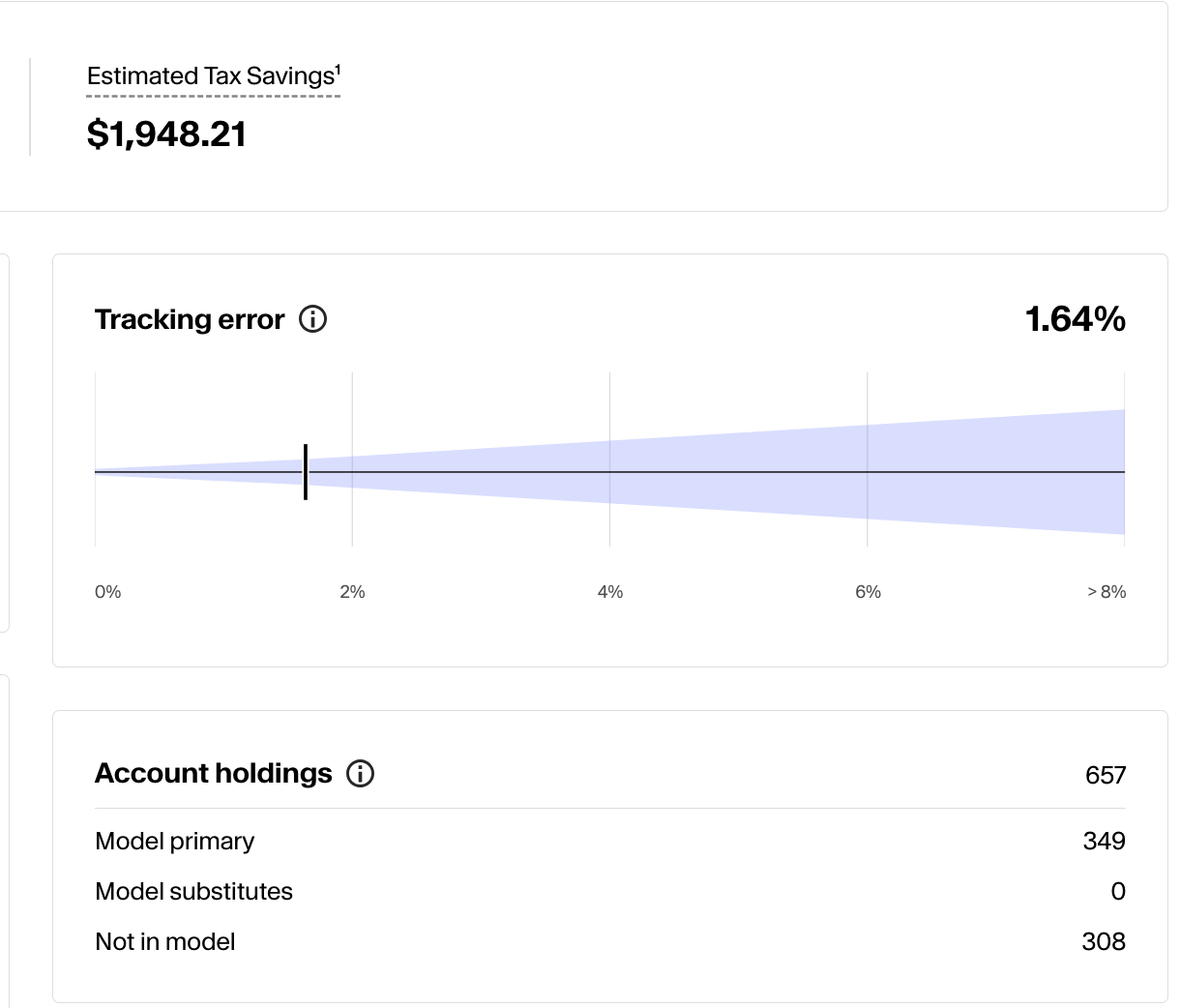
Turn volatility into an advantage

Screenshot of a financial report showing estimated tax savings, with gains deferral of $871.00, short to long of $0.00, and loss harvesting of $1,077.21, totaling estimated tax savings of $1,948.21. Below is a line graph illustrating total tax losses harvested over time from January to May, with a steadily increasing green line.

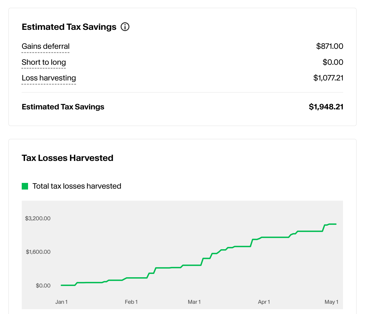
We systematically capture losses to offset gains and reduce taxes over time. Our custodian has run the numbers on the potential value of active tax management; see what they found.

Direct indexing

Own the market—your way.

Diagram comparing a simple circle divided into four quadrants labeled 'Standard Index' to another circle with segments filled in, labeled 'Direct Indexed Portfolio'.
A bar chart showing sector exposure with different colors representing sectors such as Financial Services, Consumer Cyclical, Consumer Defensive, Real Estate, Basic Materials, and Utilities, with the larger portion in blue for Financial Services and smaller sections for other sectors.

Direct indexing allows for greater tax efficiency, customization, and control than traditional funds. It’s a more flexible, modern approach to core investing. Read more about this strategy and who it may work for.

Structured notes

Strategies your investing app won't have

Line graph showing trends in structured product, stocks, and bonds over time. The structured product line is green and upward trending, stocks are blue with fluctuations, bonds are orange and steady.
Line graph with blue line showing increasing values, shaded areas under the line, dotted baseline, and grid background.

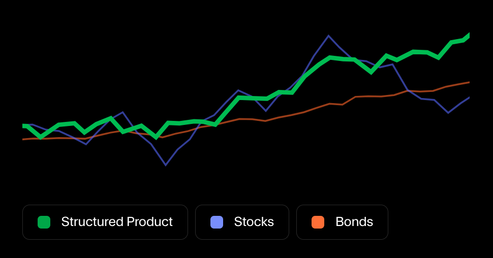
Structured notes can provide defined outcomes, downside buffers, or enhanced income depending on the environment. Used thoughtfully, they can complement traditional portfolios. Read more here.

Tax strategy

The biggest impact is before April

Pie chart showing portfolio allocation with 57% equities and 43% fixed income, followed by three circular diagrams illustrating asset location: taxable account with 100% equities, tax-deferred account with 20% fixed income and 80% equities, and a tax-free account with 100% equities.
A chart comparing proposed and reference tax strategies, showing that 67% of the proposed strategy is tax free, while only 2% of the reference strategy is tax free, with ending portfolio values of over $30 million and nearly $26 million respectively.

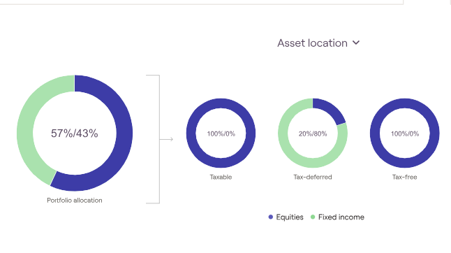
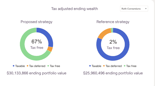
Taxes are one of your biggest expenses—we plan accordingly. From income timing to investment structure to account optimization, we look for opportunities to improve your after-tax outcome.

Private assets

Go beyond public markets.

Two icons representing different financial sectors: the first icon for Real Estate showing three houses, and the second icon for Private Equity with a target-like design. Labels underneath read 'Real Estate' and 'Private Equity.'
Two labels with icons; the first labeled 'Private Credit' features a green background with a white circle and several black lines, the second labeled 'Infrastructure' has an orange background with a network of white dots connected by black lines.

Direct access to private investments that can offer diversification from public markets. These are carefully selected and thoughtfully integrated into your broader portfolio. (Often limited to accredited investors)

Debt solutions

Debt that works for your situation.

A table displaying loan information for two customers, Millman Family and Johnson Household, including details on line size, availability, and buffer status.

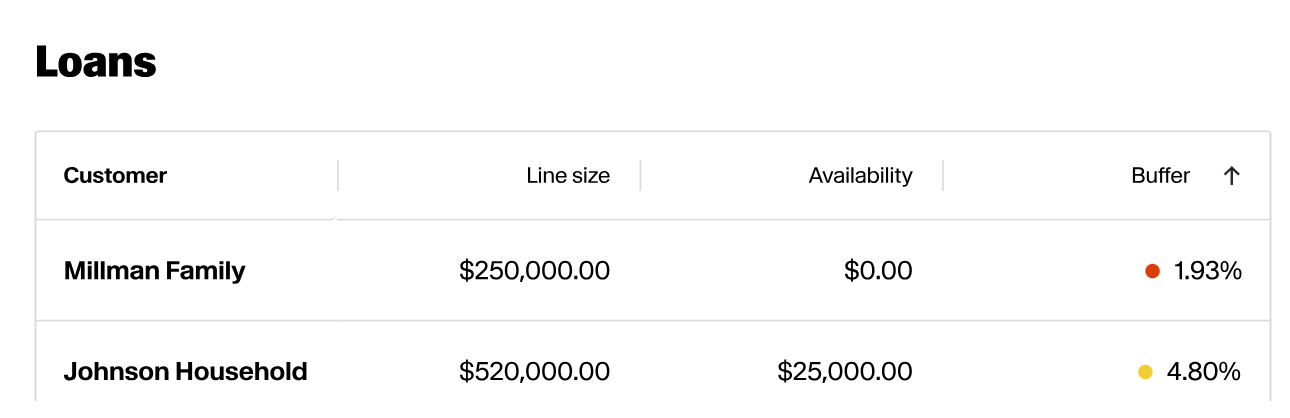
Tap into asset based lines of credits sourced against multiple lenders in order to optimize across rates. Keep your assets working in the market while achieving liquidity.

Insurance review

Protect against what can’t be predicted.

Bar chart comparing protection need, proposed insurance, and current insurance, with dollar amounts on the y-axis from $0 to $1 million.
Bar chart showing LTC's impact on invested assets from 1984 to 1995 with three categories: assets without LTC expense, assets with LTC expense and existing insurance, and impact of proposed LTC insurance.

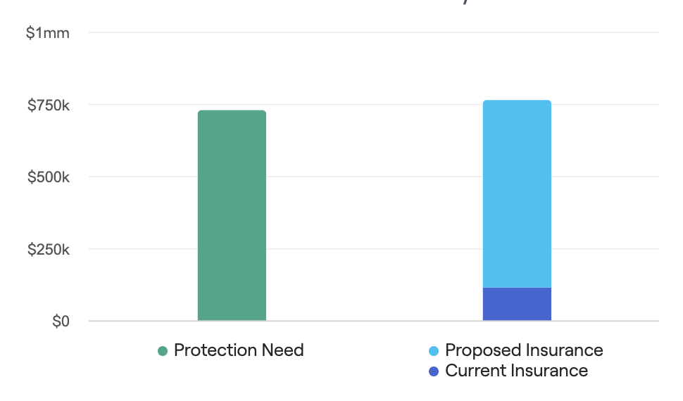
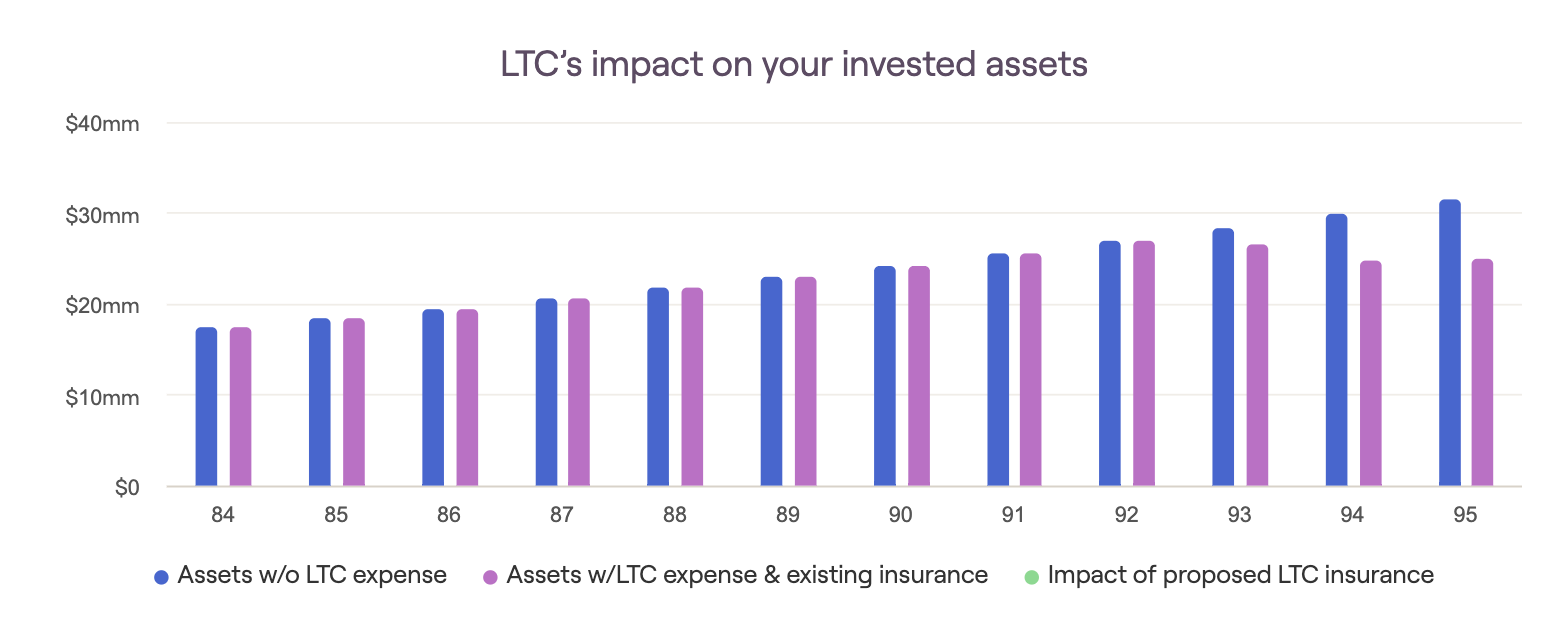
We evaluate your coverage to ensure you’re fully protected, can connect you with top providers if you have gaps. Smart risk management is part of good planning.

Get in Touch